Banner image Link to Northern Research Station Home page Link to Forest Service Home page Link to Forest Service Home page Link to United States Department of Agriculture website
You are here:   Climate Change Atlas / Tree Atlas / Combined Species Outputs / Future Polar Mean Centers
Polar Diagrams of Potential Changes in Mean Centers
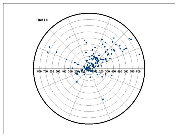
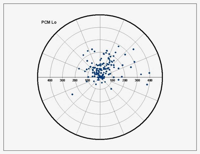
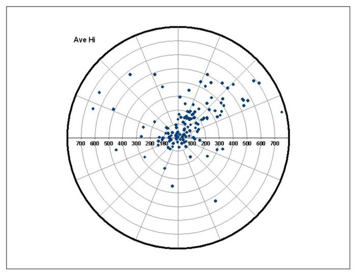
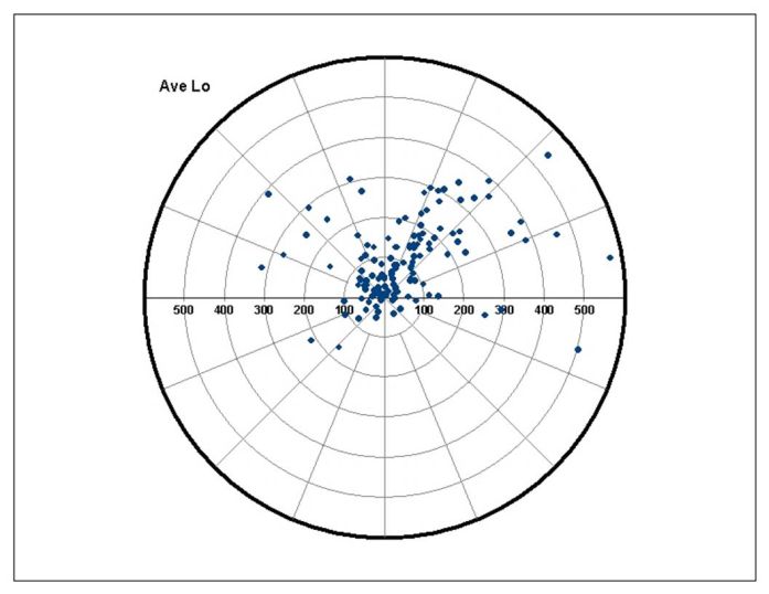
The links below allow you to explore potential changes in distance and direction of mean centers of suitable habitat for 134 tree species for the Hadley High (harsh scenario), PCM Low (mild scenario) and the GCM3-Avg. High and GCM3-Average Low (the average of all the three GCM scenarios for high and low carbon emissions).   Context-Sensitive Help    

Potential changes in distance and direction of mean centers of suitable habitat for 134 species, according to the Hadley A1f1 emission scenario. Note the 0-900 km scale on the spokes.

Mean Center Polar Graph - Hadley High

Potential changes in distance and direction of mean centers of suitable habitat for 134 species, according to the PCM B1 emission scenario. Note the 0-500 km scale on the spokes.

Mean Center Polar Graph - PCM Low

Potential changes in distance and direction of mean centers of suitable habitat for 134 species, according to the average high emission scenarios (PCM, Hadley, GFDL). Note the 0-800 km scale on the spokes.

Mean Center Polar Graph - GCM3-Avg High

Potential changes in distance and direction of mean centers of suitable habitat for 134 species, according to the average low emission scenarios (PCM, Hadley, GFDL). Note the 0-600 km scale on the spokes. Mean Center Polar Graph - GCM3-Avg Low